Scott Thomas has laid out a new assignment:
Creative Exposure.
Read about it on his site and join if you get inspired.

This time we are urged to tell a little about the exposure details.
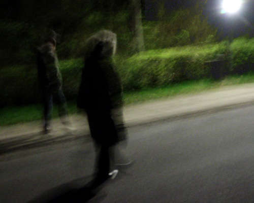
I wanted to try capturing movement and the mood in walking at night time. I tried different ways.
The data for this shot is 1/4 sec, ISO 6400, f/4.5, fl=27mm(x1.6)
It is shot while walking – both the persons in the image and the photographer.
Maybe the image is too bright? Let me know what you think.
I got some good advice for this image. So I modified it a little. Thanks for the help.
If you hadn’t told me it was a night scene I would have thought it was late afternoon, maybe on a partly cloudy day. So maybe for the mood you’re trying to convey, it is too bright? But I don’t know how you can get the movement effect if you don’t have that brightness.
You’re right Gerry. -As usual 🙂
I tried darkening the image, but haven’t reached a result I like better. Anyway, I have a week to shoot a better image.
Maybe I should have taken the picture when the shadows had clearly different directions…..
. . . but this particular picture gets at something important to you or you wouldn’t have been staring at it and asking if it’s too bright. You can’t ignore that.
You are right Gerry. It still puzzles me. I have a lot of other things to see to, so it have to wait until I have the time – or I MUST do something.
Wow, spooky scene! like a dream! I do not mind that it is bright>
Thanks Chris. Lets see if I can modify it…
I have to say it’s spooky also. I think that bright light has its purpose. When I first saw the image, made me think of 2 souls walking toward the light.
This looks like an impressionist painting Carsten. Pretty colors. What if you cropped out the light? I find my eye is being drawn to it, rather than the subjects. I wonder….?
Carsten, this is a very fine contribution. I like this picture so much – because of the light, the movement and the tension, very creative!! I don’t think it is too light, but it could have been funny if you had taken the situation with different settings and posted different results?
Wow, what an interesting shot! I like the textures and I don’t mind the light. I think it adds a little drama.
Posted the recap to this assignment today, Carsten. Stop by when you get a chance.
Thanks to all of you for your comments.
Some of you might have noticed that this is the third version of the image.
I had trouble with it. I shot it with Scotts assignment in mind. In fact I shot several images, but the others didn’t show what I wanted. This one came nearest to the goal I had in mind, but there was still something wrong – and I couldn’t figure out what it was. A very creative ( and a little shy ) friend gave me a clue, and I changed the image. I think it is better this way.